You’ve probably heard the term. Maybe your designer mentioned it. Maybe you’ve seen one for a bigger company and wondered if that’s something your little business in Woodstock actually needs.
Short answer: probably yes.
Not a 200-page corporate brand bible. Not a design agency’s self-promotional PDF. But something — a clear reference document that answers “what does our brand actually look like” — makes a real difference once you start putting your business out into the world.
Here’s what a brand style guide is, what’s in one, and whether it makes sense for where you are right now.
What a Brand Style Guide Actually Is
A brand style guide is a document — usually a PDF or shareable file — that defines the visual rules for your brand. How your logo gets used. What colours represent you. What fonts you use. How your brand sounds in writing.
It’s the reference document that makes consistency possible.
Why consistency matters more than most people think
Here’s the thing about branding: familiarity is the goal. You want people to see your logo, your colours, your style — and immediately connect it with your business. That connection builds trust over time.
But it only builds if you’re consistent. If your Facebook header uses different colours than your business card, and your website uses a slightly different logo variation than your flyers — the visual signal gets muddied. It doesn’t break your business. But it costs you the compounding trust that comes from a recognizable brand.
A style guide is what makes consistency systematic instead of accidental.
What’s Typically in a Brand Style Guide
The short version: logo, colours, fonts, and voice. The detail in each of those depends on your business and the complexity of your branding.
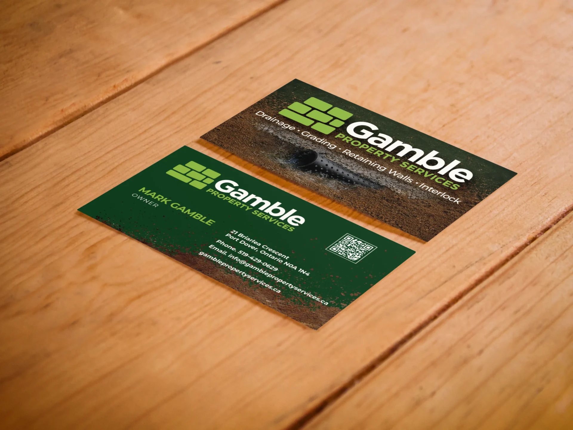
Logo usage rules
Your logo section shows all approved versions of your logo and how to use each one. That includes:
- Primary logo (the full-colour version you use most often)
- Secondary variations (horizontal version, stacked version, icon only)
- Colour inversions (for dark backgrounds)
- Clear space rules (how much empty space surrounds the logo)
- What NOT to do (stretch it, change the colours, put it on a busy background)
The don’ts section often matters as much as the do’s. Especially once you start handing your logo to print shops, social media managers, or event organizers.
Colour palette
Your brand colours, with the exact codes needed across different formats:
- HEX code (for web and digital)
- RGB values (for screen)
- CMYK values (for print)
- Pantone reference (optional, for high-end print work)
Primary colours, secondary colours, and how they’re meant to work together. This is what ensures your Instagram graphics match your business cards match your website header — even when three different people are creating those materials.
Typography
Your brand fonts and how to use them. Usually two or three typefaces:
- A heading font (bold, attention-grabbing)
- A body text font (readable, clean)
- Sometimes a third accent font
The guide should also show hierarchy — what size and weight is used for page titles, subheadings, and body copy. This is what keeps your materials looking visually organized and professionally considered.
Voice and tone
This is the piece most small businesses skip — and the piece that arguably matters most.
Your visual identity gets people’s attention. Your voice is what makes them trust you.
A brand voice section documents: how you talk to clients, the personality behind your writing, words you use (and words you avoid), and the feeling someone should walk away with after reading anything you’ve published.
It doesn’t need to be long. Even a single page that captures “this is how we sound” — direct, warm, local, honest — makes a real difference when you’re writing a social caption at 11pm wondering if this sounds like you.
What Makes a Good Brand Style Guide vs. a Bad One
The bar is lower than you think. A useful style guide doesn’t need to be a beautifully designed masterpiece.
Useful: specific, practical, easy to use
Five to eight pages that cover your logo, colours with actual codes, fonts with actual names, and a page on tone. That’s it. Saved as a PDF you can actually find.
Not useful: too long, too vague, never opened
I’ve seen “brand guidelines” that are 40 pages of design rationale that nobody on the team ever reads. I’ve also seen one-page documents that have all three hex codes and nothing else. Both miss the mark.
The goal is: someone working on your brand should be able to open this document and find the answer they’re looking for in under two minutes.
Do You Actually Need One?
Here’s the honest answer: it depends on where you are.
You probably need one if:
- You have staff, contractors, or a social media manager creating content for your brand
- You’re working with a print shop or photographer
- You’ve invested in professional branding and want to protect that investment
- You find yourself repeatedly explaining “our colour is the blue one” to anyone who works with you
- You’re growing and want consistency to scale with you
You can probably wait if:
- You’re just starting and still figuring out your brand direction
- You’re the only one creating brand materials
- You haven’t yet had professional branding done
The latter point matters: a style guide is most valuable when it’s based on well-considered, intentional branding. A guide that documents an inconsistent or unresolved brand doesn’t solve the underlying problem.
If you’re still at the “I’m not sure about my logo” stage, branding comes before the style guide — not after.
What a Branding Package From a Designer Includes
When you work with a designer on branding, the deliverables should include more than just the logo files.
A solid branding package typically includes:
- Final logo files in all formats (SVG, PNG, EPS — transparent background versions, colour and black versions)
- Colour palette with all codes
- Font files or font licence information
- A basic brand style guide documenting all of the above
- Sometimes: business card design, social media templates, or a brand pattern
What you do NOT want: just a JPG of your logo. That’s not a brand delivery. That’s a starter kit with pieces missing.
If you’ve been handed a logo file but nothing else, and you’re not sure whether that’s normal — it’s worth asking your designer what else you should have received.
How Long Does It Take to Put One Together?
If you’re starting fresh with a designer, a basic brand style guide is typically delivered as part of the branding project. It doesn’t add significant time when it’s built alongside the brand itself.
If you’re trying to create one retroactively — documenting a brand you’ve been using for years — it’s a half-day to full-day process with a designer to pull together the elements, check them for consistency, and document them properly.
FAQ
Is a brand style guide the same as a brand identity?
Not exactly. Your brand identity is the full visual system — the logo, colours, fonts, the visual feel of your brand. A style guide is the document that records and explains that identity. Think of the identity as the artwork and the guide as the instruction manual.
How much does a brand style guide cost?
If it’s included in a branding package, it typically doesn’t add cost — it’s part of the deliverable. If you’re commissioning one retroactively, expect $300–700 from a local designer depending on complexity.
Do I need to share the style guide with others?
Yes — that’s the point. Share it with anyone who creates materials for your brand: your social media manager, your{ print shop, a contractor who builds forms or presentations for you.
What software is used to create a brand style guide?
Designers typically create them in Adobe InDesign, Illustrator, Canva, or Figma. The format you receive (usually PDF) matters more than the software used.
What if my brand doesn’t have consistent colours or fonts yet?
A style guide can’t fix a brand that hasn’t been properly designed. The guide documents existing decisions — it doesn’t make them for you. If your brand lacks consistency, that’s a signal to address the brand itself first.
Can I make my own brand style guide?
Yes. If you have an existing brand, you can document it yourself using Canva or a simple Google Doc. It won’t be as polished as a designer-created guide, but a functional reference document is better than none.
What’s the minimum a brand style guide needs to include?
Logo (all approved versions), colour codes, and fonts. Everything else is additional value. Those three things, documented clearly, will handle 90% of the consistency questions that come up.
How often does a brand style guide need to be updated?
When the brand changes. A logo update, a colour refresh, a font change — update the guide at the same time. Otherwise it becomes out of date and people stop using it.
The Bottom Line
A brand style guide isn’t corporate overhead. It’s the document that protects the investment you’ve made in your brand — and makes consistency achievable without having to explain your logo every time.
If you’re working with a designer on your branding, make sure it’s included in what you receive. If you’ve had your brand done and never got one — it’s worth asking about.
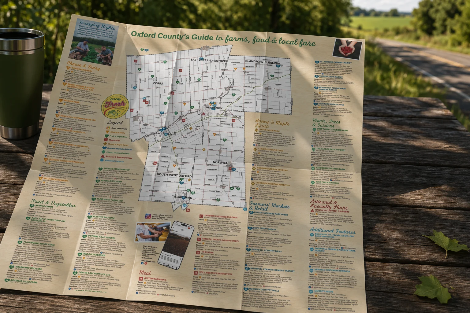
I build brand style guides as part of every branding package I deliver. If you want to know more about what that looks like for a small business in Brant or Oxford County, let’s chat.