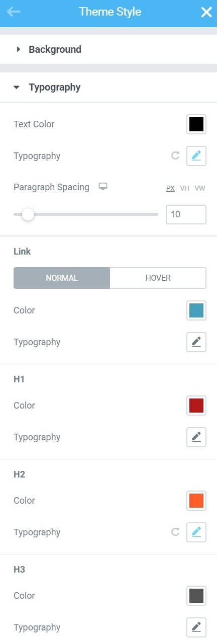
Theme Style settings are global settings that allow you to set default styling options for various elements, such as Backgrounds, Headings, Buttons, Images, and Form Fields. These settings override the theme styling settings and takes its place, allowing you to use Elementor to set styles for elements not built by Elementor. By default, this will apply styles only to non-Elementor elements, for example, WooCommerce checkout fields, Contact Form 7 labels, 3rd-party headings and much more. If you prefer, you can force these Theme Style settings to also apply to Elementor-built elements as well.
Note: Elementor Pro users can also set Global Custom CSS which lets you apply custom CSS rules to your entire site.
To Apply Theme Styles To Elementor Elements:
In order for Theme Style settings to apply to most of Elementor’s elements and widgets as well, you will need to disable Elementor’s default colors and fonts.
- Disable default colors and default fonts by going to Elementor > Settings and placing a check in the boxes next to Disable Default Colors and Disable Default Fonts.
How To Set Theme Styles
Click the Hamburger menu in the upper left corner of any page or post’s widget panel to access the Theme Style settings.

Background
BACKGROUND TYPE
Classic
Color: Choose the background’s color
Image: Choose an image from the media library
Gradient
Color: Choose the first gradient color
Location: Set the location of the first color. This will affect the spread
Second Color: Choose the second gradient color
Location: Set the location of the second color. This will affect the spread
Type: Choose between a linear or radial gradient
Angle: Set the gradient angle
Typography
Text Color: Choose the color of the default text
Typography: Change the typography options for the default text
Paragraph Spacing: Set the amount of default spacing after a paragraph (margin-bottom)
LINK
Normal | Hover
Color: Choose the default color of links for both normal and hover states
Typography: Change the default typography of links for both normal and hover states
H1-H6
Color: Choose the default color for each Heading (H1, H2, H3, H4, H5, and H6)
Typography: Set the default typography options for each Heading (H1, H2, H3, H4, H5, and H6)
Buttons
Typography: Change the default typography for buttons
Text Shadow: Set the default text shadow for buttons
Normal | Hover
Text Color: Choose the default color for button text
Background Color: Choose the default background color of buttons
Border Type: Set the default type of border for buttons (None, Solid, Double, Dotted, Dashed, Groove)
Box Shadow: Set the default box shadow options for buttons
Border Radius: Set the default border radius to control corner roundness of buttons
Padding: Change the default button padding settings
Form Fields
LABEL
Color: Choose the default text color for the Field Labels
Typography: Set the default typography options for Field Labels
FIELD
Typography: Set the default typography options for Input Field text
Normal | Focus
Text Color: Choose the default text color for Input Field text
Background Color: Choose the default background color for Input Fields
Border Type: Set the default type of border for Input Fields (None, Solid, Double, Dotted, Dashed, Groove)
Border Radius: Set the default border radius to control corner roundness of Input Fields
Box Shadow: Set the default box shadow options for Input Fields
Transition Duration (ms) (Focus only): Set the default amount of time, in milliseconds, for the Focus Transition to take place.
Padding: Set the default padding options for Input Fields
Images
Normal | Hover
Border Type: Set the default type of border for Images (None, Solid, Double, Dotted, Dashed, Groove) in both Normal and Hover modes
Border Radius: Set the default border radius to control corner roundness of Images in both Normal and Hover modes
Opacity: Set the default opacity level of Images in both Normal and Hover modes
Box Shadow: Set the default box shadow options for Images in both Normal and Hover modes
CSS Filters: Set the default CSS Filters: Blur, Brightness, Contrast and Saturation for images in both Normal and Hover modes
Transition Duration (ms) (Hover only): Set the default amount of time, in milliseconds, for the Hover Transition to take place.
Undo / Redo & Draft / Publish
Just like any other Elementor editing you might do, Theme Style woks with the Revisions and History controls, so you can undo / redo any changes, and can always revert back to an earlier version of your Theme Style design.
Theme Style also works with Draft and Publish modes, so you can test the changes and save them to draft, without having them affect your live site. Your live site will only get the changes applied when you click the Theme Style’s Publish button.


